So, your website is going mobile. What is it going to be, Responsive Design or Adaptive Delivery? This is the big dilemma of our days since most website owners wish the best possible solution in order to go mobile and reach the biggest possible audiences.
Is responsive design is the panacea when it comes to your demanding business needs?
Responsive design is indeed an amazing way of using the same codebase to serve desktop and mobile users.
A single codebase and you are good to go with less worries for your developers, sometimes with a lower budget and without the trouble of constant maintenance of the multiple code versions to suit each different device.
Sadly, all the above happen only in theory.

In reality, what responsive design does, is adjusting your website’s complexity and size to any mobile device. Which in practice, can be a really slow procedure since each time a mobile device tries to open your website, it first has to go through your entire website’s information (yes, the irrelevant too) in order to determine what to display and how.
Now you know why most times responsive websites are so slow or sometimes look ‘’broken’’and drive you away before they even load on your smartphone.
What is best for a demanding business website is adaptive delivery. A separate website design, mobile-optimized (i.e. built for the specific use of your client’s devices) that loads fast and offers the best possible user experience.
Adaptive delivery allows you the freedom to fine tune the appearance and functionality of your website on particular devices. You may also optimize image sizes and increase its speed or adjust your website according to how your clients behave in mobile devices than your desktop users.
If your business depends largely on your website visitors or you own an e-commerce business, then maybe you shouldn’t risk it with an easy yet dysfunctional solution.

Yes, adaptive delivery does involve re-coding and maybe a higher budget but if you wish for a truly user-friendly website that will optimize your images and all multimedia content in your user’s devices then, do not think about it.
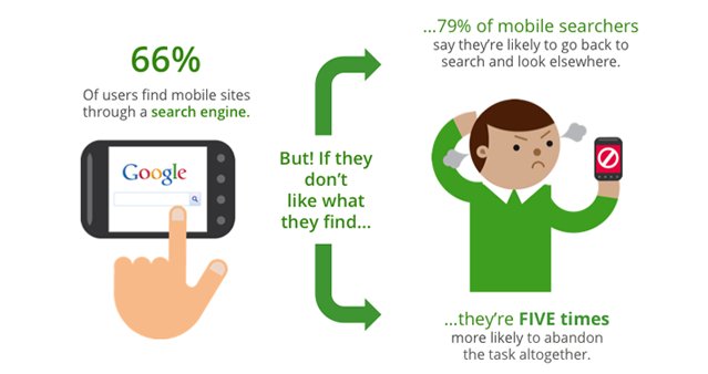
Mobile device users tend to reject websites and never go back if they have to wait long or look bad or can’t find what they need in just 2 or 3 clicks.
Don’t just Go mobile; adapt to the trend.
Take a look at our mobile application solutions and don’t hesitate to ask our ideas about your business website’s ideal mobile version!


